
Colour is a fascinating subject. Besides the visual sensation of colour in our everyday world, there is far more to how we experience and perceive colour. When it comes to colour printing, it’s an important facet that can totally change the impact of your design and how customers react to it. Understanding how colour is formed and, more importantly, the connections between different colours is vital to a successful design. Effectively applying colour to a design project has a lot to do with balance — and the more colours you use, the more complicated it is to achieve balance
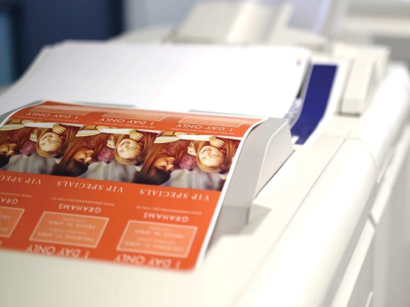
It is important to understand how colour is handled and reproduced when dealing with printed media. The role of colour in printed material can be particularly impactful – with strong vibrant colours often standing out. If used haphazardly, these same colours may not help get your message across, hence why it is important to understand the psychology of colour when you are designing for print.
Colour Systems
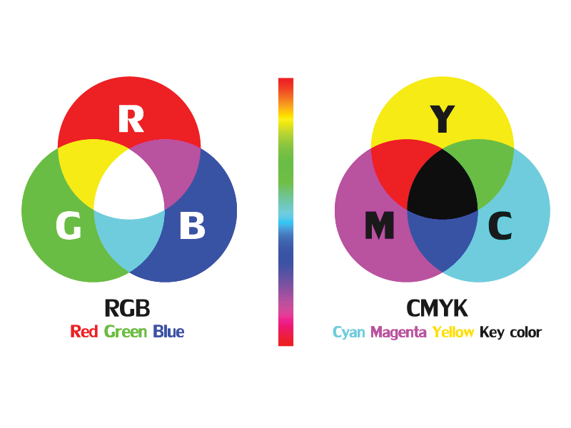
There are two primary colour systems by which colour is reproduced – additive and subtractive (also known as reflective.) We use both methods in our daily lives – the screen you are viewing this on uses additive colour to generate all the colours you see, while a printed version of this article would use subtractive. In simple terms – anything that emits light (such as a screen, a projector, even the sun) uses additive. While everything else, which instead reflects light, uses subtractive colour.
Additive colour is based on red, green and blue (RBG) and works with anything that emits light. The mixture of different wavelengths of light creates different colours, and the more light you add, the brighter and lighter the colour becomes. In additive colour, white is the combination of colour, while black is the absence of colour.
Subtractive colour is based on cyan, magenta and yellow. It works on the basis of reflected light, rather than pushing more light out. The way a particular pigment reflects different wavelengths of light determines its apparent colour to the human eye. In subtractive colour white is the absence of colour, while black is the combination of colour – but it’s an imperfect system. The pigments we have available to use don’t fully absorb light (preventing reflected colour wavelengths), so we have to add a fourth compensating pigment to account for this limitation. We call this ‘key’ (hence why it’s called CMYK) but essentially it’s black. Without this additional pigment, the closest to black we’d be able to render in print would be a muddy brown.
Due to these differences, designers need a way to get consistent colour results when working with both systems — for instance, if you’re designing a logo to use on your website but also want to get a business card printed. That’s where the Pantone Matching System (or PMS) can help. Colours can be matched for web and print (as well as for different types of printing surfaces) to ensure a uniform appearance. The Pantone system makes it easy for designers, clients, and printers to collaborate and ensure that the final product looks as intended.
Understanding Colour
Our minds see something (like grass, for example) and information sent from our eyes to our brain tells us it’s a certain colour (green). Objects reflect light in different combinations and translate them into the phenomenon we know as ‘colour.’ For example, when you are looking for a can of Coca-Cola, your brain immediately searches out the red colour first and the logo/branding second. When it comes to printed media, people decide whether or not they like a product in 90 seconds or less, with 90% of that decision based solely on colour choice.
But how are you meant to design for everyone, when everyone responds differently to colour? The truth is, colour is too dependent on personal experiences to be universally translated to specific feelings. There are, however, broader patterns to be found in colour perceptions that can guide you. So, how do people typically respond to different colours?
Yellow = Optimistic
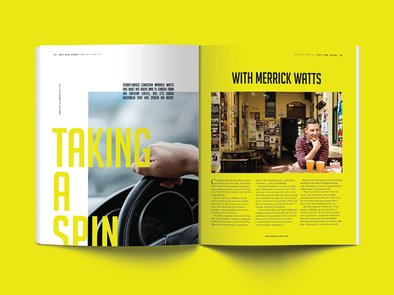
Let’s start with yellow. Thanks to our sun (and its subsequent sunshine) yellow is often associated with feelings of optimism, warmth, and hope. Yellow is also thought to release serotonin in the brain, and speed up metabolism. Pure/bright yellow used in printed media can be very successful at grabbing attention, but can also be visually jarring or even hard to view if not used thoughtfully. Yellow works well with contrasting colours (think black, greys and navy) but can be a disaster if used with white. Be careful with desaturated and greenish yellows, as they can give the perception of being sickly or unpleasant. Historically, yellow was used to signify a quarantined area. Yellow can quickly become overpowering if used in excess, but effective when applied thoughtfully.
Red = Energetic
Red has many connotations. It is the colour of blood and can convey violence, but it is also the colour of the heart, bringing feelings of love and affection. Fire is also red, which brings both feelings of warmth and danger. It is an energetic and striking colour which gets the pulse racing. It is a primary colour that will dominate your design if not used sparingly. Red is used to snag attention and is popular and arguably the most overused colour in branding – think Coca-Cola, Netflix, YouTube, etc. In print design, red can be a powerful accent colour. Just remember it can have an overwhelming effect, especially in its purest form.
Orange = Ambitious
Orange is a fun and exciting colour. It emits the same brightness as yellow and commands the same energy level as red, but is not as confronting. Orange is often associated with nature – think the colour of the changing seasons, earth and the fruit. Orange is the colour of creativity, change and movement. Its playfulness makes it a fun colour to use in your designs – especially when complimenting it with blue/green tones. Being such a strong colour with high visibility; orange is great for promoting and highlighting certain aspects of your design.
Black = Sophisticated
Like red, there are both negative and positive connotations connected to black. Black means death, fear, mystery and the unknown. Black is technically not a colour though. In additive colour, black is the absence of light and in subtractive colour, it absorbs all the colours of the visible spectrum and reflects none of them to our eyes. Regardless – black is a very sophisticated colour when it comes to print media. Black is professional and credible, and it can be edgy as well. It is often associated with wealth and power. Its neutral tone allows it to work well with just about any other colour – an absolute joy to work with.
Blue = Calming
When asking people what their favourite colour is, blue is a popular choice. Blue brings feelings of tranquillity, peace, and strength. Blue is the colour of the sea and the sky, which evokes a sense of trust and security – hence why it’s popular in branding and print media. However, in the English language it also signifies sadness or depression, so using it thoughtfully in conveying your message is paramount.
Green = Pleasing
Green is the colour of life and nature. As humans, we are instinctively drawn to green, as it represents fertile land and is very pleasing to the senses. Green is the colour of peace, envy, wealth, luck, generosity, and fertility. It is widely used in the health sector because it is relaxing to look at and evokes a sense of calm. It is often used in print media to convey a natural and organic aesthetic.
Purple = Elegant
Purple evokes a sense of elegance and class. It is often associated with royalty, magic, mystery, and piety. It stimulates feelings of elegance but like blue, it has soothing and calming influences. It is often used in the beauty and health sectors. It is a very powerful colour to use in design, being almost universally appreciated.
Brown = Durable
Brown may not be the most glamorous of colours, but it serves a great purpose in design. It is a completely natural colour and is associated with wood, soil, human hair colour, eye colour and skin pigmentation. You need to be cautious when using brown though, as it is often associated with dirt and lack of cleanliness, poverty, faeces, and plainness. Used in design, it is commonly applied as a background colour or texture. When used intelligently, brown gives the impression of reliability, durability, and friendship.
White = Purity
White represents purity and cleanliness. It evokes feelings of innocence, divinity, and perfection. On the contrary, it can also feel sterile, clinical and empty. Like black, white is not technically a colour, rather the combination of all the colour waves in the spectrum (sunlight). Paper is white, so you will probably work with ‘white space’ when designing for print. White works with nearly every colour, except for lighter shades of yellow and orange. When designing a successful logo, the rule of thumb is it should always be designed in black and white first, with colour added for emphasis/branding.
Colour stimulates our brain and decision making, so it is paramount to be thoughtful when used in printed media. The psychology of colour is a complex subject that lands at the intersection of art and science – a dynamic that makes designing for print so interesting. The next time you are choosing colour for your printed media, keep this guide in mind – happy designing.
Let us know of any unusual colour combinations that have worked for you in print, in the comments, below.