
Following a trend is sometimes a good business practice; sometimes, people just snatch a great idea before you can think of it. If it works for your business as well, a judicious use of the technique may be warranted. However, there is a limit, especially when it comes to aspects of your company that are obviously apparent.
Fonts are an aspect of printing that are consistently overused when a popular font is found. Here we will detail some of the most overused fonts of 2016 and name some of the typography trends that you can expect in 2017.
The Most Overused Fonts of 2016
Times New Roman
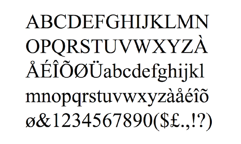
If you are still using Times New Roman as a main font, you owe it to your business to find a more unique alternative. The reason TNR makes the list every year is because it is an easy read and already a standard. The font is great – if you are turning in a college term paper. Otherwise, you need something that helps your brand to stand out.
Brandon Grotesque
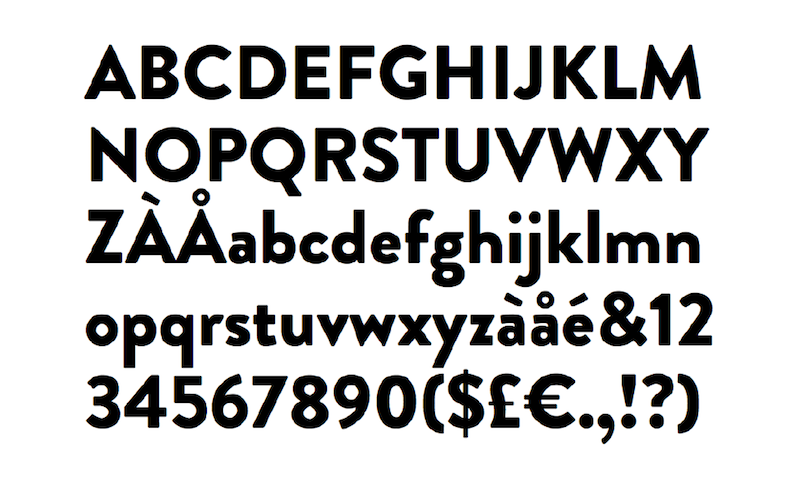
Brandon Grotesque is a great font if you are still living in 2012. The letters are bold and bright, but they are just a cliche now. It is time to move on – its avant garde qualities have faded into the ether along with TNR.
Calibri
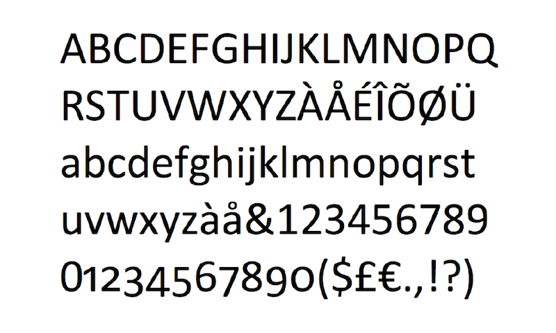
Calibri is the default for the Microsoft Office suite. Although it is an easy font to change, no one ever does (unless they change it to TNR). Deliver tax documents in Calibri if you must. Use a new font for your prints that showcases the personality of your brand.
The Most Popular Fonts For 2017 and 2018
Sansation Typeface Modern Font
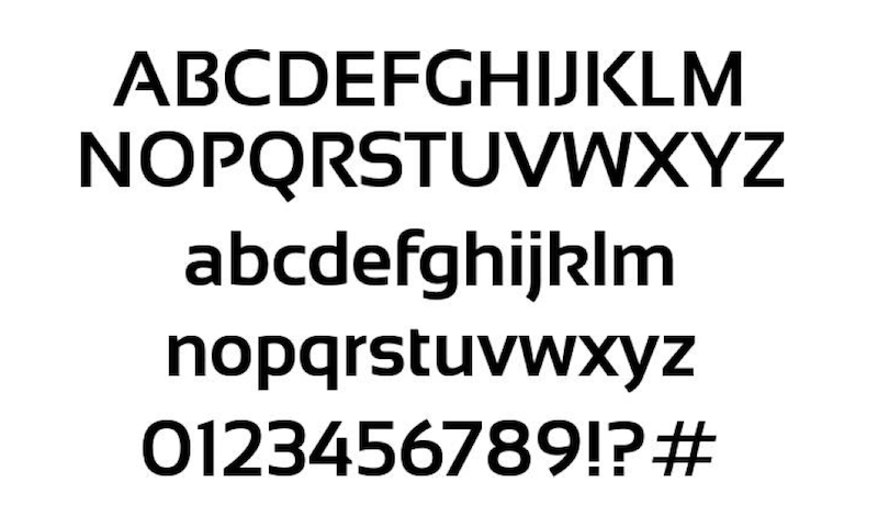
A bit wider and bolder for minimalist, big background responsive websites, Sansation Typeface Modern Font is sure to become a standard for 2017. It looks great in bold and normal, giving it the ability to communicate ideas in a prioritized way without mixing typeface. The numerics give off the perfect mix between a futuristic computer font and a traditional sales look, so your “50% off” sale pieces will stand out without feeling overbearing.
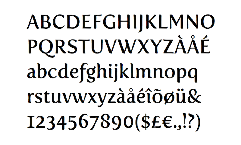
Megalopolis Extra Typeface

Megalopolis had its initial run of popularity around 2004 as the first wave of dot com companies began looking for a courageous font to attract a new breed of online consumer. It fell off the map for a while, gaining a reputation for being slightly too Barnum-and-Bailey. However, it is making a comeback in a slightly redesigned form and more feature options including figure styles, ligatures and alternates.
Fertigo Pro Typeface
Fertigo Pro has been used quite readily by the RPG gaming niche market. With the popularity of these games in mainstream media, the font is sure to make its mark in the wider world of marketing as well. The Pro version has extended language support, and best of all, it can be easily found for free on many typeface websites.
Walkway Free Typeface
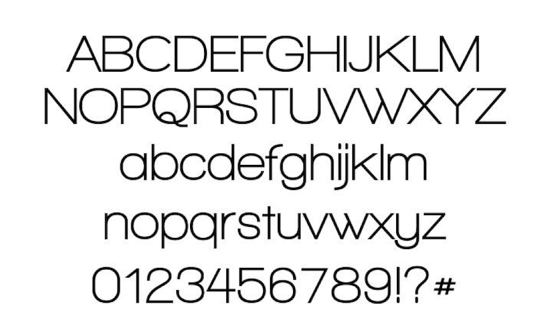
Walkway Free is one of the simplest, most futuristic looking fonts on the market today. Its alternatives, including UltraExpand, bring a level of elegance to a piece while leaving plenty of open white space for another main idea or secondary theme if you want the font to take center stage. The font is clean from beginning to end, numerals to special characters, and demands respect.
Do not be afraid to follow in the footsteps of an industry leader if the trend also fits your business profile. However, take the trend from your unique perspective. This is especially important concerning the fonts that you use, because the choices that you make early on in the year will likely affect your product for the entirety of 2017 and 2018.
What font do you use for your business? Have you considered a change? Let us know what you like and dislike about your font in the comments, below.